CSS Mastery - Content Layout
Using Positioning
- Elements are initially positioned as static, meaning that block-level elements stack up vertically.
- We can give elements relative positioning , allowing us to nudge them around relative to their original position without altering the flow of elements around them. Doing so also creates a new positioning context for descendant elements. That last fact is what makes relative positioning really useful. Historically, the ability to nudge elements around was an important ingredient in many old-school layout hacks, but these days we can often get by without them.
- Absolute positioning allows us to give an element an exact position with regard to the nearest positioning context, which is either an ancestor with a positioning other than static, or the html element. In this model, elements are lifted out of the page flow, and put back relative to their positioning context. By default, they end up where they originally should have ended up were they static, but without affecting the surrounding elements. We can then choose to change their position, relative to the positioning context.
- Fixed positioning is basically the same as absolute, but the positioning context is automatically set to the browser viewport.”
摘录来自: Andy Budd and Emil Björklund. “CSS Mastery”。 iBooks.
Creating Triangles in CSS
.comment:after {
  position: absolute;
  content: '';
  display: block;
  width: 0;
  height: 0;
  border: .5em solid #dcf0ff;
  border-bottom-color: transparent;
  border-right-color: transparent;
  position: absolute;
  right: -1em;
  top: .5em;
}
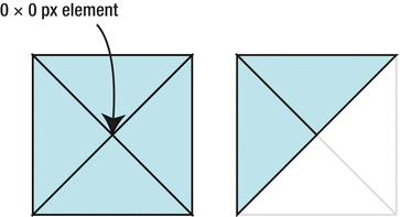
Automatic Sizing Using Offsets
Without any declared size, the absolutely positioned element will fall back to the size needed to contain the contents within it. When we declare offsets from opposing sides of the positioning context, the element will stretch to accommodate the size it needs to fulfill these rules.
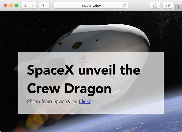
<header class="photo-header">
  <img src="images/big_spaceship.jpg" alt="An artist's mockup of the "Dragon" spaceship">
  <div class="photo-header-plate">
    <h1>SpaceX unveil the Crew Dragon</h1>
    <p>Photo from SpaceX on <a href="https://www.flickr.com/photos/spacexphotos/16787988882/">Flickr</a></p>
  </div>
</header>
“Assuming we don’t want the semitransparent “plate” holding the heading to take up a specific width, we can instead position it from the right, bottom, and left sides and let it figure out its measurements as well as the top edge position by itself:”
摘录来自: Andy Budd and Emil Björklund. “CSS Mastery”。 iBooks.
.photo-header {
  position: relative;
}
.photo-header-plate {
  position: absolute;
  right: 4em;
  bottom: 4em;
  left: 4em;
  background-color: #fff;
  background-color: rgba(255,255,255,0.7);
  padding: 2em;
}
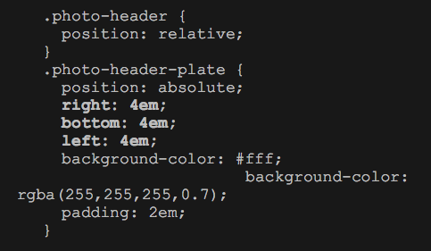
Regardless of the dimensions of the image, the plate will now sit at the bottom of the image at 4 ems from the bottom and sides. This gives us something that works nicely at different screen sizes—the top edge of the plate will adjust to the content height if there are line breaks.
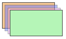
“Any element that has an explicit z-index declaration set to a positive value is higher in the stack than an element without one. Elements with negative values are shown behind elements without a z-index.
But the z-index is not the only thing controlling how elements are stacked. We also have the concept of a stacking context . Stretching the deck-of-cards analogy a bit, each card can also be its own deck, and cards can only be sorted in relation to the current deck level. There’s always a root stacking context to begin with, and positioned elements with a z-index other than auto are sorted inside that. As other contexts are formed, they create a hierarchy of stacks.
Specific properties and values create these new stacking contexts. For example, an element with position: absolute and a z-index declaration set to anything but auto will form a stacking context for descendant elements inside it. From inside a stacking context, it doesn’t matter how large or small the z-index value is: you can’t reorder something in relation to another stacking context (see bellow code). ”
摘录来自: Andy Budd and Emil Björklund. “CSS Mastery”。 iBooks.
<!DOCTYPE html>
<html lang="en">
<head>
  <meta charset="UTF-8">
  <title>Stacking contexts and opacity</title>
  <style>
    .a, .b, .c, .d {
      position: absolute;
      border: 2px solid #333;
      width: 200px;
      height: 100px;
    }
    .a {
      top: 10px;
      left: 10px;
      background-color: #f3bf8b;
    }
    .b {
      background-color: #5a6bff;
      opacity: 0.5;
      top: 20px;
      left: 20px;
    }
    .c {
      top: 10px;
      left: 10px;
      background-color: #e299f3;
      z-index: 9999;
    }
    .d {
      top: 40px;
      left: 40px;
      background-color: #acf3ae;
      z-index: 3;
    }


  </style>
</head>
<body>
  <div class="a"></div>
  <div class="b"><div class="c"></div></div>
  <div class="d"></div>
</body>
</html>
“In preceding code. Containers A, B, C, and D are all absolutely positioned, where C is a child element of B. Containers C and D have z-index applied, but since container B has an opacity lower than 1, it creates a new stacking context, separate from the others. The z-index will not place C in front of D, no matter how high the number”
摘录来自: Andy Budd and Emil Björklund. “CSS Mastery”。 iBooks.
“Further ahead in the book, we’ll encounter other examples, like the transform and filter properties, which can also trigger the creation of new stacking contexts. At the end of this chapter, we’ll get to some peculiarities with using z-index and flexbox.”
摘录来自: Andy Budd and Emil Björklund. “CSS Mastery”。 iBooks.
Inline Block as a Layout Tool
行内块级元素作为布局工具
让我们添加如下的代码片段:
<p class="author-meta">
  <!-- image from Jeremy Keith on Flickr: https://flic.kr/p/dwFRgH -->
  <img class="author-image" src="images/author.jpg" alt="Arthur C. Lark">
  <span class="author-info">
    <span class="author-name">Written by Arthur C. Lark</span>
    <a class="author-email" href="mailto:arthur.c.lark@example.com">arthur.c.lark@example.com</a>
  </span>
</p>
“The contents of the . author-meta paragraph will now line up, with the bottom edge of the image sitting on the baseline of the text. Any whitespace character, including for example the line break between the image and the line where the author info starts, will be rendered as a blank space. The width of that space depends on the font family and the font size (see Figure 6-12).”
摘录来自: Andy Budd and Emil Björklund. “CSS Mastery”。 iBooks.
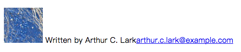
Next, we’ll turn the image and the author info into inline blocks:
.author-image,
.author-info {
  display: inline-block;
}
In terms of rendering, the component looks the same at this stage. The difference is that we can start treating the image and the info as blocks. For example, we can put the name and e-mail address inside the author info on separate lines next to the image, by changing them to display as blocks:
.author-name,
.author-email {
  display: block;
}
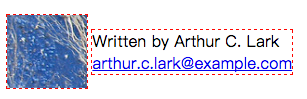
We are now fairly close to the visual result of, for example, a floated image next to a block of text (as in the “media block” example from Chapter 3). One difference is that the last baseline of the author info block is aligned with the bottom of the image. We see the result in Figure 6-13, where we’ve also added a dotted outline around both image and author info to visualize how the two elements relate.
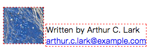
“We can now shift the author info relative to the image by changing the vertical-align property. When the alignment is set to top, the top of the author info block will align with the top of the image (see Figure 6-14).”
.author-image,
.author-info {
  display: inline-block;
  outline: 1px dashed red;
}

.author-name,
.author-email {
  display: block;
}

.author-info {
  vertical-align: top;
}
“Figure 6-14.Aligning the author info to the top of the image with vertical-align: top”
Vertical Centering with Inline Block
Now, let’s say that the design we want is for the author info block to be vertically centered in relation to the image. It may be tempting to try something like this:
.author-info {
  vertical-align: middle;
}
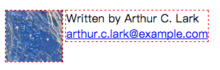
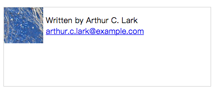
…but that probably won’t have the effect you expected! Figure 6-15 shows the results.
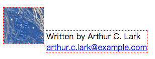
Figure 6-15.The position of the author info when using vertical-align: middle
This is where it gets somewhat tricky. The keyword middle when applied to inline blocks means “align the vertical center of this inline block with the middle of the x-height of the line of text.” In this instance, there is no inline text. Therefore, the image (being the tallest element on the line) is what determines the height of the line box and where the baseline ends up. The center of the x-height thus ends up just above the bottom of the image. In order to center the author info on the vertical center of the image, we need to make both elements refer to the same “middle”:
.author-image,
.author-info {
  vertical-align: middle;
}
摘录来自: Andy Budd and Emil Björklund. “CSS Mastery”。 iBooks.
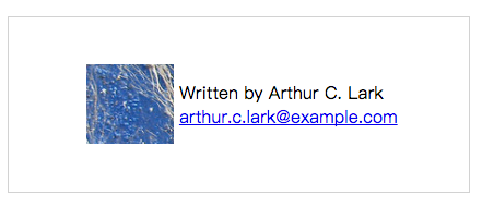
“With the image being an inline block, it too becomes vertically centered on the same vertical point as the author info, resulting in the layout we wanted, shown in Figure 6-16.”
“Figure 6-16.Applying vertical-align: middle to both image and author info vertically centers them on the same point”
.author-image,
.author-info {
  display: inline-block;
}

.author-name,
.author-email {
  display: block;
}

.author-image,
.author-info {
  vertical-align: middle;
}
For the purpose of using inline block display as a layout tool, there are two important takeaways in terms of vertical alignment:
- To make inline blocks align to the top (much like floats do), set vertical-align: top.
- To vertically center contents with regard to each other, make sure they are all inline blocks, and then use vertical-align: middle.
Vertical Centering Inside a Container Element
That last bullet point in the previous list enables us to vertically center content inside a container of any height, with a bit of trickery. The only prerequisite is that the height of the container is set to a definite length.
First of all, we apply a height to the .author-meta block. We’ll also add a border to make the changes a little easier to spot (see Figure 6-17).
.author-meta {
  height: 10em;
  border: 1px solid #ccc;
}
In order to align them vertically we need to add another inline block element, which takes up 100% of the height. This element will force the alignment point for the middle keyword to end up in the middle of the container. For this, we’ll use a pseudo-element. Figure 6-18 shows how the hypothetical baseline gets calculated when this “ghost element” is added.
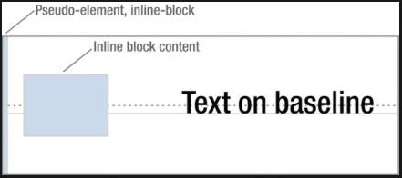
Using a 100% tall pseudo-element to force the middle keyword to end up representing the vertical center of the container
.author-meta:before {
  content: '';
  display: inline-block;
  vertical-align: middle;
  height: 100%;
}
At this point, the whole .author-meta container will in effect have a single line box taking up the whole height. As the pseudo-element is an inline block with vertical alignment set to middle, the other inline blocks will be vertically aligned to the center of the container. All we need to do now is to center the content horizontally. As inline blocks respond to text alignment, we need to use text-align:
.author-meta {
  height: 10em;
  text-align: center;
  border: 1px solid #ccc;
}
.author-info {
  text-align: left;
}
In actual fact, the horizontal centering is not exactly right. Remember that any whitespace character in the line box will be rendered as a single blank space? The pseudo-element will create one such space, pushing the content to the right by a few pixels. We can negate the width of the blank space by applying a negative margin to the pseudo-element:
.author-info:before {
  margin-right: -.25em;
}
Why -.25em? In this instance, it happens to be the width of a whitespace character in the current font. This is a bit of a “magic number,” and will vary with the font used. As such, it is not very robust, and not something that we recommend for any systematic layout work.